Every summer, Apple takes the wraps off a new version of OS X. This past June, Craig Federighi introduced Yosemite.[1] His performance was electrifying, and throughout the week, he was seen taking selfies with developers, telling jokes and being the overall cool guy from Apple.
Beyond the flashiness of the keynote, however, there was real substance. OS X Yosemite is a big leap forward for OS X’s user interface and the way it interacts with iOS.
Like Mavericks before it, OS X Yosemite is available for free on the Mac App Store. The annual verbiage about checking on system requirements, having a good backup and making sure your third-party apps work on the new operating system all apply this year.
Welcome to Yosemite
Instead of a wide-ranging review, life (READ: starting Relay FM, having a baby, etc.) dictated I spend time on just the revamped UI. That said, Yosemite does come with major changes to iCloud data storage, not to mention Handoff, Continuity and Apps Extensions. All of those things are awesome, but maybe its better to think of this article as follow-up to On the past, present and future of Apple’s Aqua user interface, which I published back in April.
While this new version of OS X is structurally the same as all of its predecessors, there’s not much left of that original Aqua look left.
Apple didn’t go all iOS 7 on OS X’s ass, though.
While introducing OS X’s new UI, Federighi insisted that the company started with the concepts of clarity and utility. Apple has worked to make OS X more approachable over the years, and with Yosemite, that means making things simpler. For example, Dock icons retain some textures, but many have lost unneeded decoration.
The Dock icons are a good example of the direction Yosemite takes as a whole; good and bad (as we’ll see with Finder). This blog post by Nick Keppol really breaks it down well.
Yosemite doesn’t have the large swaths of white with colorful, text-only buttons that iOS does. It’s still OS X, but it’s been flattened out and made a little more translucent.
Let’s dive in.
Helvetica Neue
Since the very earliest builds, OS X’s GUI has been defined by the typeface Lucida Grande, which has graced the menus, labels and stock UIs shipping from Cupertino since 1999.
Here’s a GIF showing the differences between the two fonts:
Helvetica Neue is tighter, with more uniform space between letters and a more consistent stroke.
While the change is a bit jarring at first for long-time Mac users, it’s one with an eye toward the future.
Here’s John Gruber in his iPhone 4 review from 2010:
It’s a subtle change, but Apple has changed the system font for the iPhone 4, from Helvetica to Helvetica Neue. The change is specific to the iPhone 4 hardware (or more specifically, the Retina Display), not iOS 4. On older iPhone hardware, iOS 4 still uses Helvetica as the system font.
[…]
Aesthetically, this change is a win. Helvetica is a great typeface; long-time DF readers know I’m a huge fan of it, and the choice to use it for the iPhone’s system font is one of my favorite decisions in Apple history. But Helvetica Neue, subtle though its differences are, is a nice improvement. It is a more Helvetica-y Helvetica.
Why change only on the iPhone 4, though? I suspect it’s because Apple’s digital version of Helvetica is better hinted for on-screen rasterization than Apple’s Helvetica Neue, which makes it look slightly sturdier on the relatively crude pre-Retina Display iPhone screen. I.e., Helvetica looks better than Helvetica Neue on older iPhones, but Helvetica Neue looks better on the truly-print-caliber Retina Display.
His point remains true today — Helvetica Neue gives a level of clarity and precision on high-density displays that Lucida Grande never could.
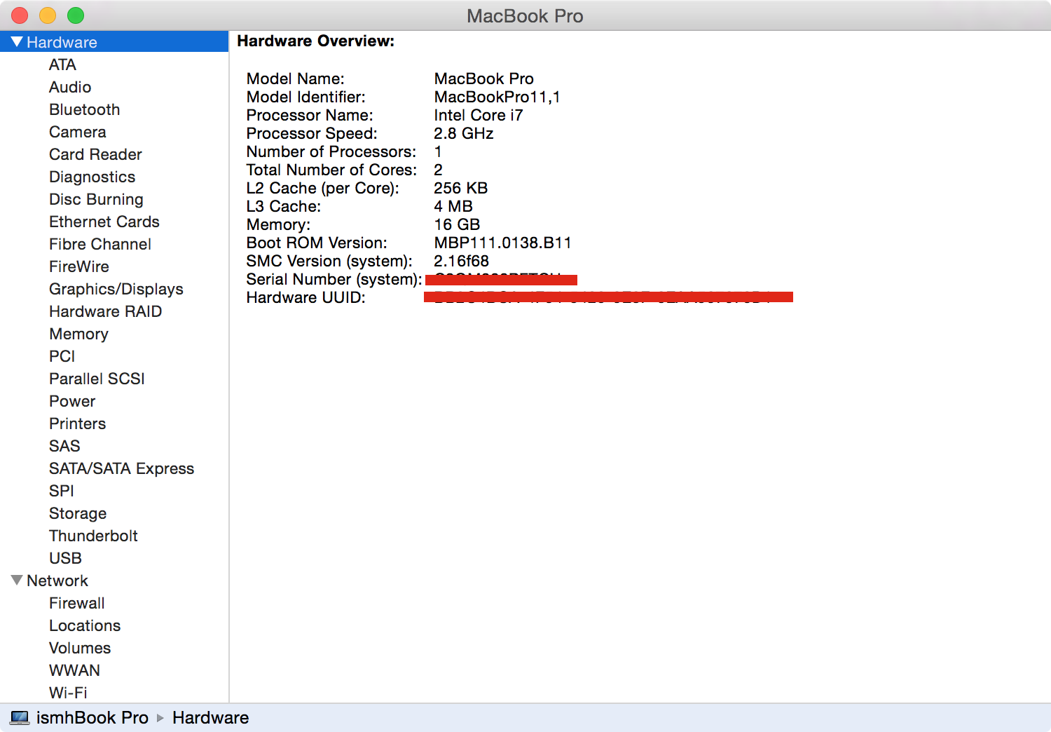
On my 13-inch MacBook Air, OS X’s menus are readable, but on the Retina MacBook Pro, they are nice to read. Some information-dense screens, like this one from the System Information app, is a little hard on the eyes:
The question I keep returning to is this:
Did Apple go to Helvetica Neue too soon?
After all, the MacBook Pro line is the only Mac with a Retina display. The MacBook Air and iMac are non-Retina, and Apple doesn’t sell a Retina-level external display for its Mac mini and Mac Pro customers.
I don’t know the answer. Yosemite looks more or less fine on non-Retina displays, but I do think it’s a step backwards from the Lucida Grande of old for a whole heck of a lot of OS X customers.
Then I see it on my MacBook Pro and kinda stop caring about anyone else.
Translucency
In a long essay about OS X’s GUI, I wrote:
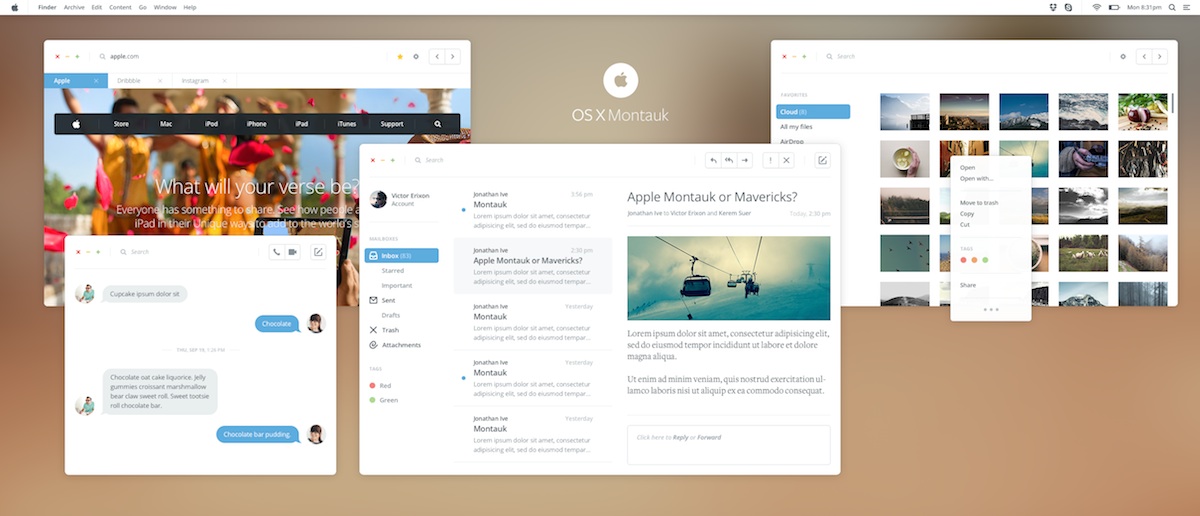
There are those “OS X Ivericks” mockups floating around and an “OS X Montauk” design over on Dribbble:
While I don’t know if Apple would go this far with OS X, it is interesting to consider.
Turns out, Apple’s design for Yosemite is in the same ballpark as that rendering. However, instead of large white UI elements, Yosemite’s loaded with translucent panels.
To create the soft glow of content below Yosemite’s menus, Notification Center and more, instead of just tinting what’s beneath, Yosemite is using the colors and programatically creating the menu bars, Notification Center and more to make them feel warmer than just a sheet of dark glass would. This gives the transparency a playfulness with the content it’s covering that otherwise wouldn’t be there.
Apple’s calling this technology Vibrancy and it’s in play in both the light and dark modes of OS X Yosemite. (More on that dark mode in a bit.)
As with iOS 7 a year ago, Apple claims that translucency can give the user a sense of place, using depth as an organizational tool. Content, Apple would say, is more important than OS X UI chrome and clutter.
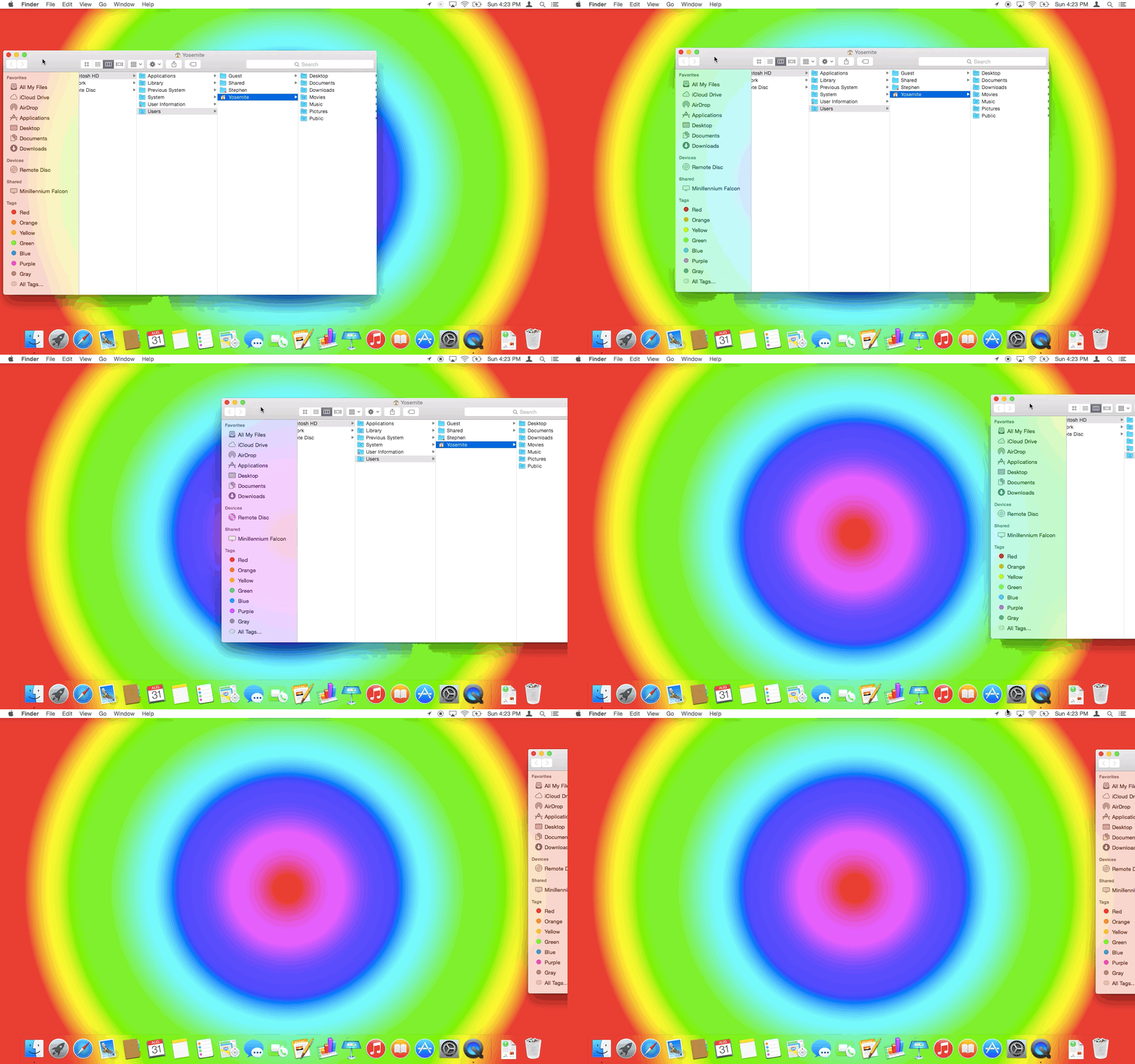
Beyond that, at WWDC, Federighi noted that translucency allows for personality, as sidebars are tinted with the colors of the windows (or Desktop picture) behind them.
This GIF shows the process in action over a custom (and rather mind-melting) wallpaper. Keep an eye on the sidebar of the Finder window:
It’s important to note that only the sidebar of active windows are transparent. If you have multiple Finder windows open, only the top one will sport a translucent sidebar; the others will be opaque as before Yosemite.[2]
Vibrancy doesn’t make the content hard to read, but like in iOS, over large sections of the screen, it just comes across as muddy.
Gross, right?
(That same effect is used when browsing Time Machine. Gone is the star field that first appeared with OS X Leopard.)
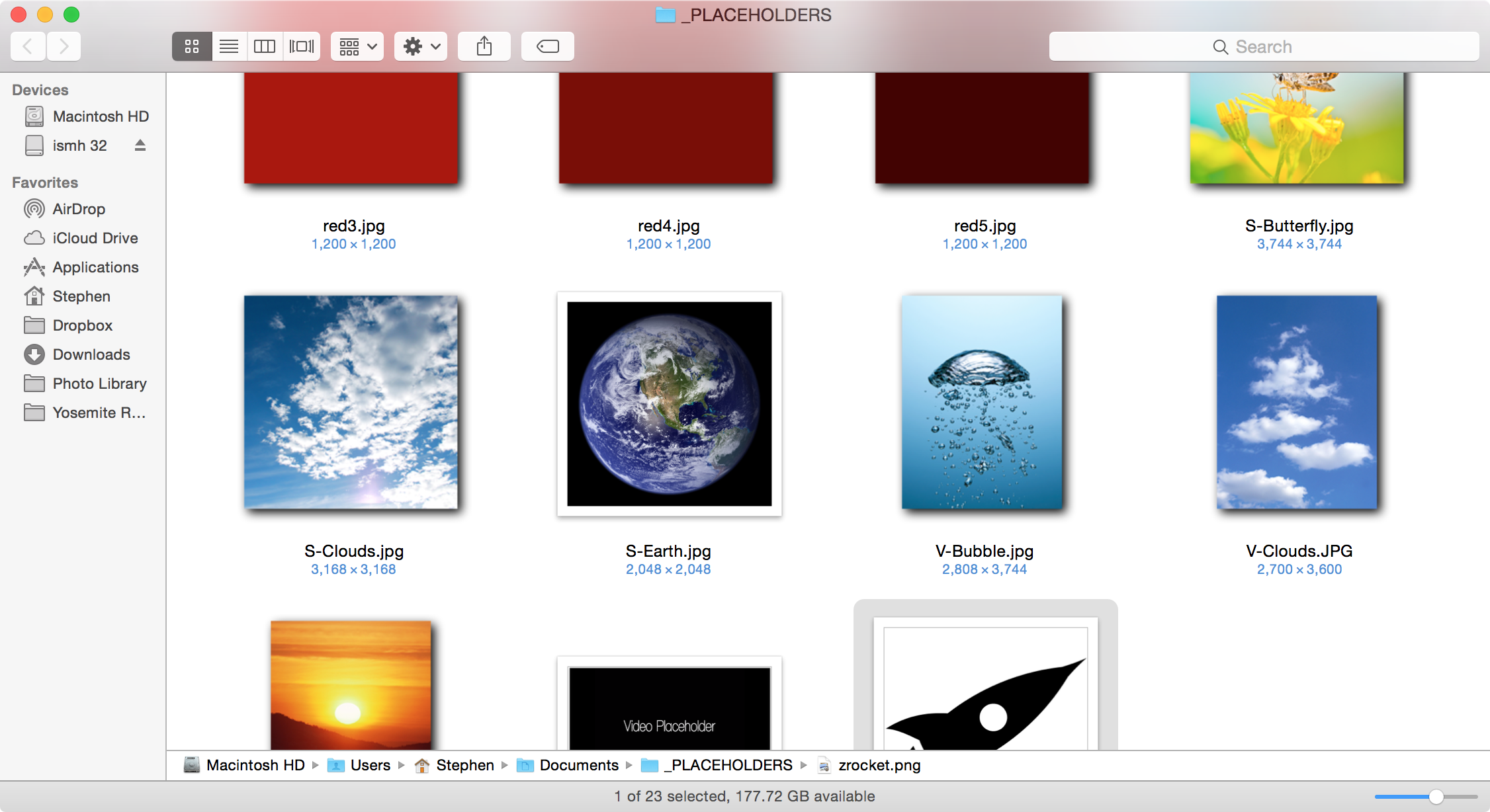
I’m not completely against this new translucency in OS X. It can add valuable information about scroll position. For example, the Finder title bar picks up the tint of the content within the window as it scrolls past the edge of the view.
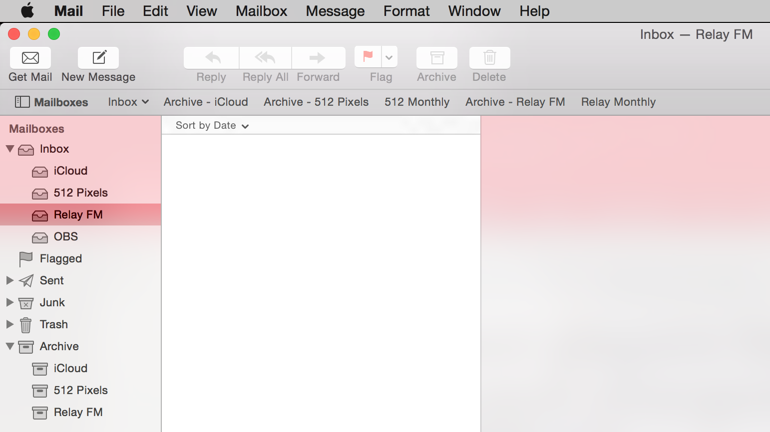
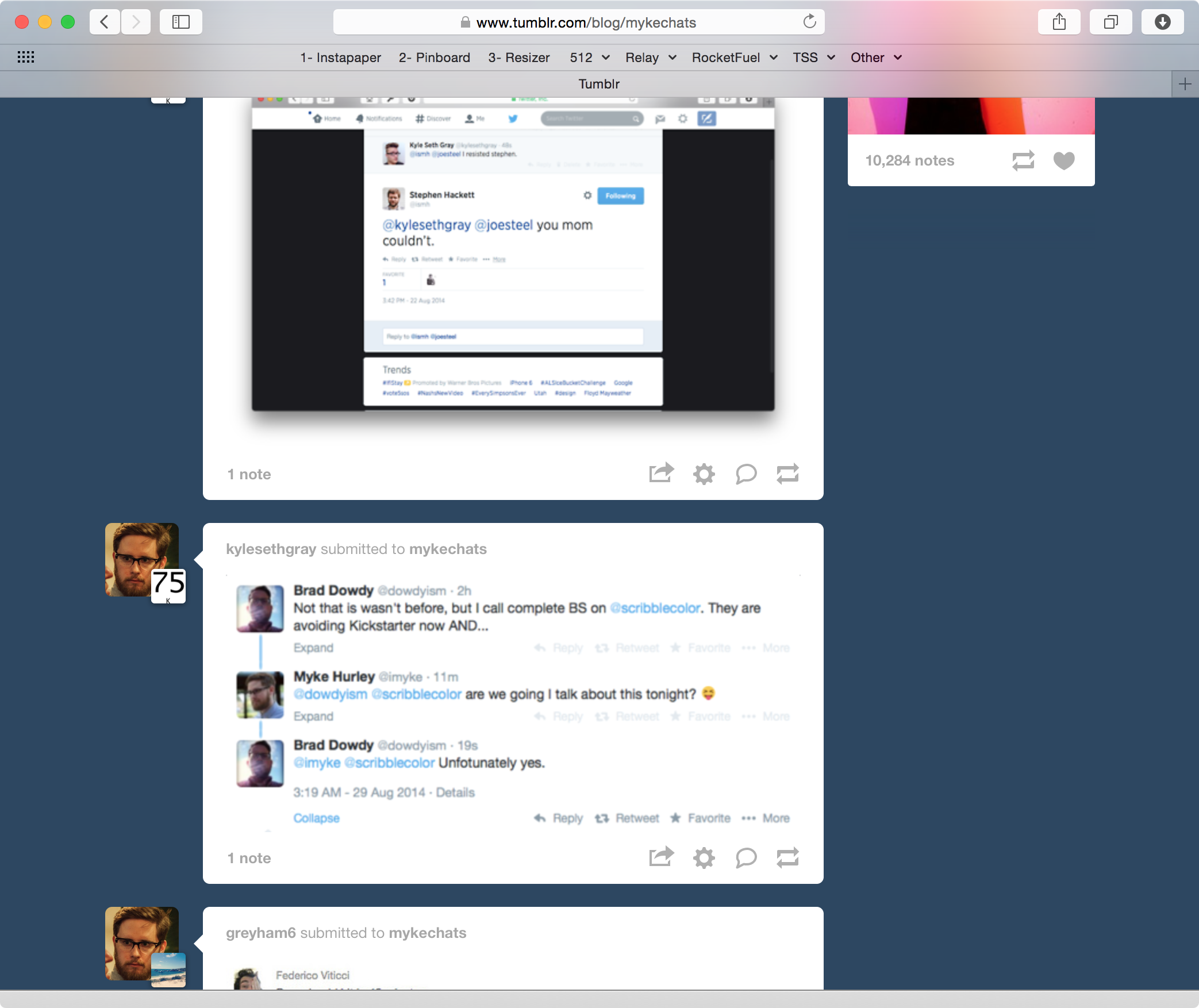
However, translucency can and does cause legibility and clarity issues under the right circumstances. In this screenshot, I have Mail open in front of a Safari window with CNN’s website loaded:
Out of the corner of my eye, the red looks like some sort of alert or flag. The fact that it’s hard to read is secondary only to the mind-bending question as to why the empty message list[3] isn’t translucent.
iOS 7 introduced this sort of transparency, but as iOS apps don’t ever have overlapping windows, it’s not as big of an issue there. However, as OS X still has a windowed UI, transparency just has too many edge cases to deal with.
To help combat this — and give Core Animation a break — only the front-most window will allow what is below to shine through. This helps make it clear which Finder window is the foremost when a lot are open at once, as the others will retain the pre-Yosemite opaque sidebars.
However, in practice, I haven’t fallen in love with Vibrancy. It looks good most of the time (when it looks bad, it looks really bad), but it can cause odd usability issues and even be distracting in certain circumstances.
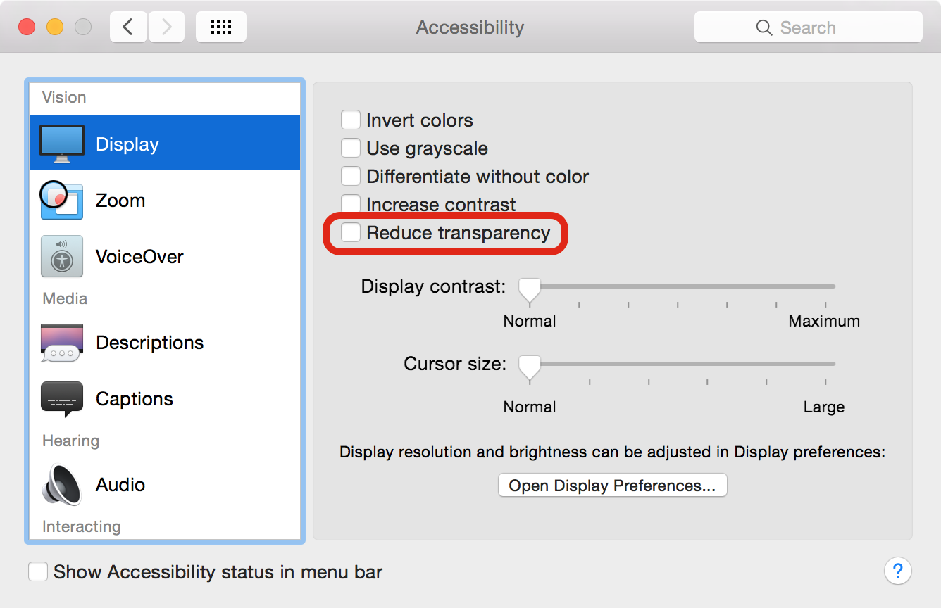
Thankfully, this little guy lives in the Accessibility preference pane:
The truth is, I’m not sure that all of the blurry transparency in Yosemite really meets Federighi’s goal of making OS X easier to use. I think it’s much more about giving OS X a little more personality. I’m not saying that’s bad; I think it’s just … unnecessary in places. Toggling transparency may make Yosemite look a little more boring, but at least everything is readable.
Dark mode
To say that Yosemite comes with a “Dark Theme” is vastly over-stating the “Dark menu bar and Dock” option found in the “General” preference pane:
As shown above, OS X’s new dark mode only affects the menu bar, Command+Tab UI, drop-down menus, the Dock and Spotlight. Everything else — from Finder windows to built-in apps — remain their normal, bright selves, no matter what System Preferences says.
Even in the very last developer builds, the dark mode had broken elements, like the labels in Finder’s File menu:
In fact, throughout OS X, there are little corners of the dark mode that are broken. Coupled with the fact that many third-party menu bar apps haven’t been updated yet, and things get gross in a hurry.
(I have no idea why the Spotlight icon is not pinned to the right. It has a tendency to move around.)
The net result of this is that dark mode feels half-baked. I’m not suggesting that Apple sherlock the f.lux guys, but I would like to see this feature fleshed out a bit more in future releases. Using a darker Dock and menu bar may be easier on the eyes, but any benefit is gone the second a white Finder window or blank TextEdit document sears your retinas.
The dark mode does bring up the topic of which Appearance theme looks best with Yosemite. For years, I’ve run my Macs with the Graphite on; muting the stoplights and menubars to a gray tone.
With Yosemite, a user can select both Blue and Graphite as before, but toggle the dark menu bar and Dock independently. The combination of the dark mode and Graphite appearance means the menu bar’s hover state can be hard to see at times:
As for me, I think I’ll be using Yosemite with the Graphite appearance and dark mode off.
Other interface changes
Yosemite’s big changes may be all about fonts and translucent sidebars, but there are lots of other UI changes packed into the release.
Spotlights and title bars
After changing the system font — what many would consider sacred across previous OS X design changes — nothing else Apple could do would feel as impactful, but the company didn’t stop there. Yosemite brings revised window controls and toolbars to the Mac.
The window controls — those red, yellow and green icons in the top-left corner have been flattened for Yosemite, but the way they work has been edited as well, as hinted at in their new hover states:
The red button still closes the window, and the yellow still minimizes the window to the Dock, but in Yosemite, the green button now puts the app in full-screen mode. The double-ended arrow control introduced in Lion is gone.
Previously, the green control would make the window bigger, but not always in a way the user expected. This behavior change makes a ton of sense to me, and I think it will be welcomed by many, many users.
(To use the old “zoom” control, press the Option key while clicking the green button or double-click a window’s title bar if System Preferences is set to ignore that input for minimizing windows.)
The toolbar — the part of the window that the stoplight and other icons sit in — has also been revised to allow for more vertical real estate for content. In many cases, including Safari, it means the old title bar is gone:
(This is also the case in Finder, Maps, Notes and more.)
While at first glance, these changes make windows look more than a little weird to the experienced OS X user, having more vertical real estate — especially on notebook displays — is welcome.
There are downsides to not having title bars, however. When a toolbar gets full of buttons, there’s less UI to click and drag on to to move the window.
Safari
As always, Apple’s tweaked their built-in apps, but Safari has received the most attention this year.
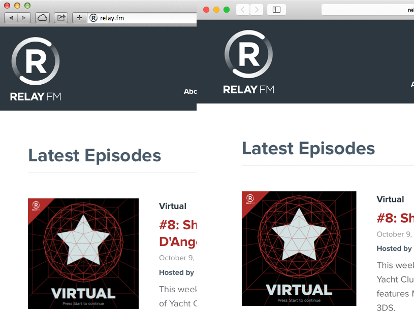
The lack of a title bar means getting to the content quicker, but the vibrancy around that pink ad on the right is nuts. My biggest problem, however, has to do with the way Apple’s changed the Toolbar. If you look closely, you’ll notice my bookmarks bar and address bar aren’t centered. The latter was knocked slightly left the second a new item was added to the right of it, despite using the “Flexible Space” item on either side of the address bar:
In addition to the re-jiggering of windows, Safari now — by default — only shows the root URL in the address bar. This means that while on relay.fm/about Safari only displays relay.fm which leads to confusion. Thankfully, this ridiculous preference can be changed in the application’s settings.
In practice, these problems aren’t that big. Safari is fast and stable, but it’s perhaps the best poster child for everything wrong with Apple these days — little things are often slightly broken in the name of progress.
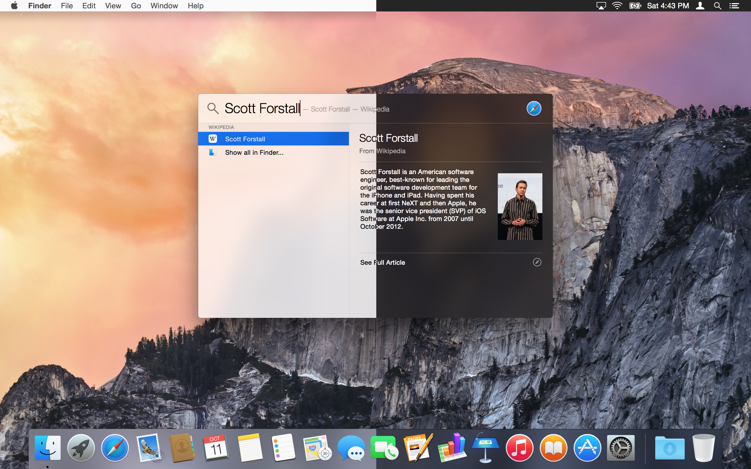
Spotlight
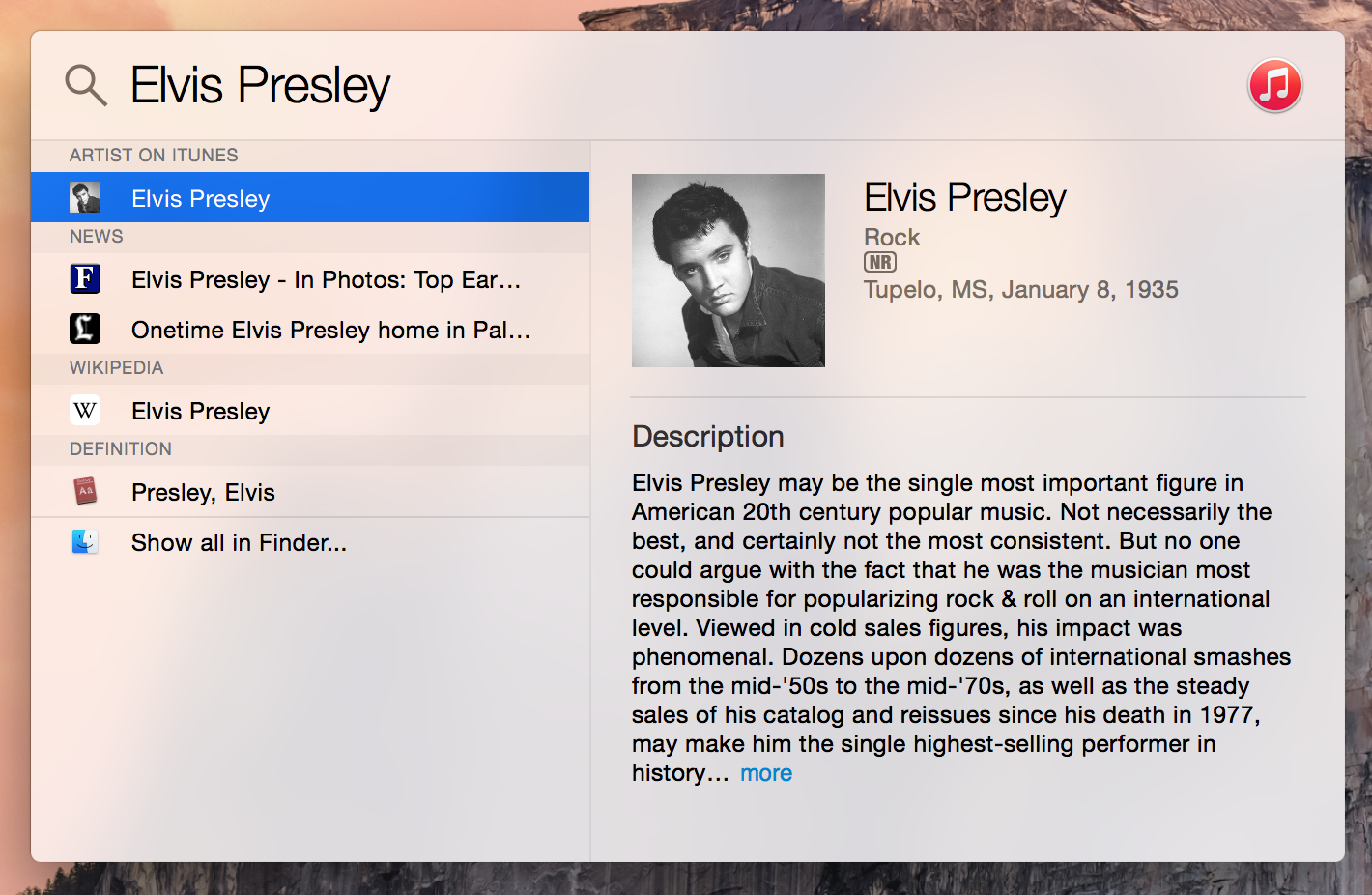
Since it’s introduction with Tiger, Spotlight has been stuck in the upper-righthand corner of OS X. With Yosemite, it’s been set free to live front-and-center:
If that looks familiar, it’s because Apple’s taken the approach of apps like Alfred, both in appearance and the ability to show data in a more helpful format.
Notification Center
Widgets can now live in two places on OS X — the Dashboard and Notification Center, which has been more or less lifted directly from iOS. Despite your preference, Notification Center is always made up of Yosemite’s dark vibrant material.
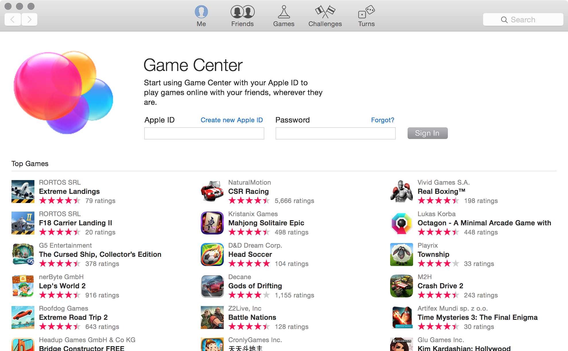
Game Center
Felt is dead, but those stupid bubbles from iOS should die, too.
Handoff
While the details of Handoff are beyond the scope of my design review of Yosemite, Apple’s tinkering with the Dock is not.
Now, if an iOS device has something it can pass to the Mac, that app icon appears at the front of the Dock, to the left of the Finder, which, in my mind at least, is heresy.
In this screenshot, I’ve hovered the new icon, showing it’s more or less what I could have guessed — a Safari session on my iPhone that I can open on my Mac. Clicking the icon will open the session in my browser.
(Handoff icons also appear in the Command+Tab switcher.)
This is a great feature, and I’ve come to enjoy it in the beta periods of iOS 8 and Yosemite, but if you’re at your Mac and multi-tasking with another device, the icon is changing. Bounce from Safari to Messages on your iPhone and Safari then Messages will take their place on your OS X Dock. In practice, it’s hard to use more than one device at a time, so this changing takes place when you aren’t paying attention. However, if someone is using one of your devices while you are at your Mac, the ever-changing icon is enough to drive you batty.
The ability to answer a phone call on your Mac is also part of Handoff, and is another UI element that is always presented as if dark mode were on:
While the equalizer and old-school phone icons are a little weird, the best part of this feature is that it’s really easy to accidentally answer a call if you’re typing quickly when one comes in and you hit the Enter key.
Apple menu changes
While I still dislike having to open the Mac App Store to update system software, Yosemite now makes it a little easier to see when updates are available.
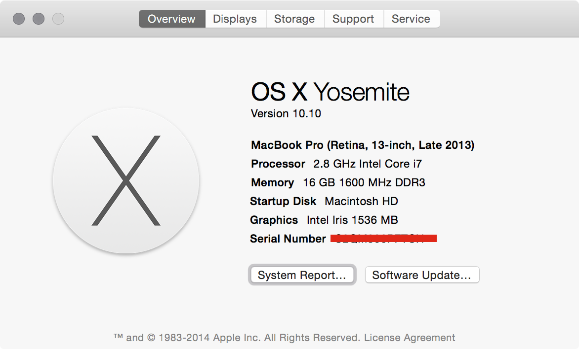
Additionally, the “About this Mac” menu item now opens the expanded “More Info…” screen that first appeared a couple of years ago. Gone is the old window that graced OS X for over a decade:
The Finder Icon
I’ve made a lot of jokes on Twitter since June about the new Finder icon. Maverick’s is on the left, and the new, meth’d out one is on the right:
All in all, I think most of Yosemite’s app icons are good, but I hate having at the new Finder art stare at me every day from my Dock. I like the bright colors, but the dopey smile is just too much for me.
In which I realize (yet again) I’m an old man
When I looked back at Aqua earlier this year, I realized that Apple’s been refining the look and feel of OS X since first announcing it in January 2000.
For the most part, these changes have made OS X more usable and better-looking. While there are outliers, Apple’s been fine-tuning OS X’s look for a decade.
In its early versions, OS X featured lots of translucency to help the user understand the placement of open windows. Yosemite does similar things for similar reasons, but modern Macs can run these graphics smoothly. That wasn’t the case in the Mac OS X 10.0 and 10.1 days, so with 10.2 and 10.3, Apple dialed it back, making OS X feel more responsive.
Sadly, Jaguar and Panther brought other issues, but as the decade ground on, Apple kept unifying and flattening things, and, for the most part, the changes were logical and welcome.
I don’t feel like I can say that confidently about all of Yosemite’s design changes. Switching system fonts and cleaning up icons are good, but the ability to see through sidebars and make the menu bar dark come with too high of a cost in their current forms. In writing this review, I’ve realized that the two major elements in Yosemite’s design that I can control — transparency and dark mode — aren’t for me.
At this point, I’m not sure referring to Yosemite’s UI as Aqua is even correct. If Aqua defines the structures and underlying philosophies that shape OS X, then it’s still present, despite the ever-growing number of changes from those original lickable buttons. However, if Aqua is just a collection of colorful buttons, windows with title bars and a predictable color scheme, it may have died the second Craig Federighi showed off Yosemite this summer.
Semantics aside, Yosemite’s UI feels awkward. Parts of it are beautiful, but parts of it are broken. Surely some of the weirdness stems from the sheer number of changes present. Yosemite is a natural evolution from Mavericks and iOS 7 a year ago, but Apple’s hit the fast-forward button. As a result, Yosemite isn’t a refined as it could be.
But hey, that’s what next year’s WWDC is for, right?
-
Don’t miss his bit about naming the new version of OS X. ↩
-
As a note, thankfully, transparent panels appear white in window-based screenshots; the background color only shines through if a selection (or all) of the screen is grabbed as an image. ↩
-
F YEAH INBOX ZERO. ↩
